home

These are the worst 10 colours to have in your home, according to an interiors expert.

Colours are an essential part of everybody's life that influence everything from our emotions to decisions. It explains why you may feel happier after admiring a yellow sunflower or depleted and lonely when surrounded by black and greys.

This powerful tool can be channelled into all aspects of our lives, from our fashion choices (if you haven't taken your personal colour analysis, you can do so here) to the way we style our homes. 

According to Feng Shui principles, an ancient Chinese art of placement, the colours used in our homes aren't just a decorative choice — they play a crucial role in shaping the energy, or "Chi", of you, your home and anyone who sets foot into your space. 

"Choosing colours for your home should be a balance of personal preference and the psychological or energetic impact those colours may have," said interior designer and founder of Melbourne-based home design company Kurved by Design, Kellie Richardson.

In fact, injecting the wrong colours into your space can create an imbalance and block positive energy — something we don't wish upon our worst enemies. 

To help you avoid a Feng Shui disaster, Richardson has revealed the 10 worst colours to have in your home, and why.

10 worst colours to have in your home.

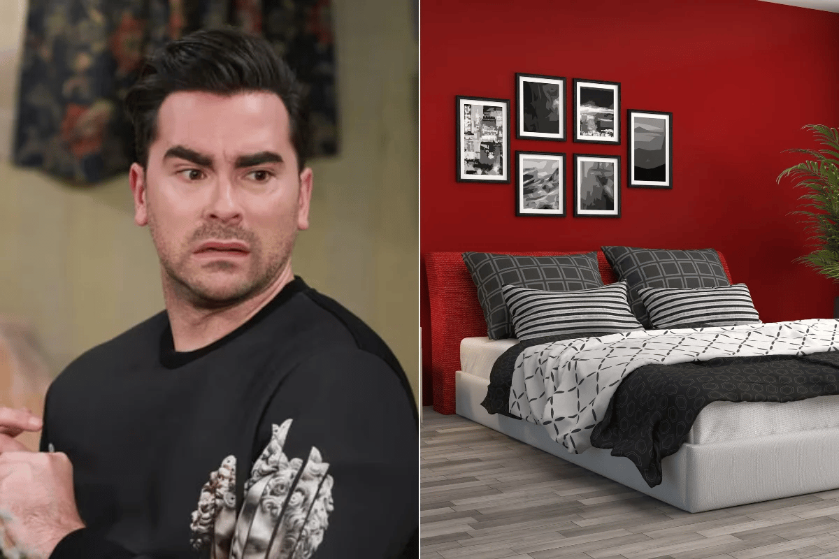
Dark or harsh black.

Black is often considered a popular, chic and versatile colour for many, especially those who favour minimalism and modernism. But according to Richardson, you should use this hue with caution. 

"It can make a space feel small, oppressive and overwhelming if used excessively, particularly in large areas," the interior designer said. 

"It tends to absorb light, creating a gloomy atmosphere, which can negatively affect mood and energy levels."

ADVERTISEMENT

Of course, that doesn't mean you have to forego black altogether. Richardson recommends using it as an accent colour rather than a dominant one, and pairing it with lighter tones to balance the space. For example, a black lounge chair or coffee table amongst light greys and gentle whites will create a clean and contemporary space. 

Intense red.

Your home should be a relaxing sanctuary that helps you feel at ease, which is the exact opposite of the mood that an intense red can evoke. 

"When used in a home, it can be energetic and stimulating, and too much of it can create feelings of anxiety, aggression or restlessness." 

It all makes sense, really, since we associate bright red with race cars, fire engines and warning signs. 

One room you especially want to keep this hue far away from is the bedroom, though, as it can "make it difficult to relax or sleep". 

If you do decide to use red in your home, incorporate it in accents or smaller rooms where its vibrancy can be contained, or where it serves a true purpose. A dining room could be a good option, as red has been found to be the most stimulating colour for our appetites. 

Overpowering orange.

Similar to red, bright orange can be just as unnecessarily stimulating and in fact, can "lead to feelings of anxiety or discomfort if used excessively". 

It's also an incredibly hard colour to complement, which means you'll end up with a mismatch and chaotic space. 

Bright yellow.

You'd think yellow is associated with happiness and energy — two moods anyone would welcome into their space. However, too much of it can be so overwhelming that Richardson says it can "even cause eye strain". 

ADVERTISEMENT

Even more concerning, bright yellow "may also lead to feelings of frustration and irritability, particularly in spaces meant for relaxation, like bedrooms or living rooms".

To combat this, opt for softer shades of yellow (hello, pastels). Or, if a brighter shade is your jam, use it in small doses, rather than a primary colour scheme.

Neon or fluorescent colours.

Just like bright yellows, neon or fluorescent colours can imbue the same unwanted energy. Sorry, maximalists. 

"Neon colours are extremely bold and can create a sense of visual chaos," Richardson explained. "They can be overstimulating and uncomfortable to live with on a day-to-day basis." (Although no shame if this is the desired energy you want to create.)

You also have to consider how bolder colours can quickly go out of style, as this will make your space feel outdated when they inevitably do fall out of the trend cycle. 

To avoid this, use bold colours sparingly in smaller decor pieces — like a fun artwork or tableware items — rather than on walls or large pieces of furniture. 

Cold grey.

Just like black, greys are favoured for being a neutral hue. However, certain cold or overly sterile shades of this popular colour can create a dull, lifeless and… ahem, "depressing" atmosphere. 

"If not balanced with warmer tones, grey can make a space feel uninviting and bleak."

Obviously, no one wants their home to feel like a morgue so opt for warmer shades of grey with undertones of beige or blue. Or, mix in warmer textures and materials to bypass that cold feeling altogether. 

Muddy brown.

Earthy tones can be grounding, perfect for a cosy home. However, one exception is muddy browns, which can "make a space feel heavy, dull and uninspired, particularly in smaller rooms".

ADVERTISEMENT

"Brown can also lack the brightness and vibrancy needed to energise the space," Richardson added. 

In saying this, not all browns are created equal. A beautiful lighter and warmer shade, like a taupe or tan, can inject much-needed warmth and vibrancy into your home.  

Stark white.

White is often favoured for its ability to create a clean and crisp space, but too much of it can feel stark, cold and clinical… like a hospital. 

"An all-white space may lack character and warmth, making it feel unwelcoming and uncomfortable." 

To combat this, Richardson recommends mixing white with soft pastels or warmer neutrals to create a more inviting space. You can also play around with textures and soft furnishings to enhance depth and interest. 

Saturated or dark purple.

Although we love an Olivia Rodrigo purple moment, it may be best to leave this hue out of spaces meant for relaxation or social interaction. 

"Dark purple can feel overly dramatic, moody or even depressing if used in large quantities," Richardson warned.

Instead of a saturated purple, lean in for lighter shades like lavender or soft plum, which will evoke a soothing and elegant effect.

Heavy green.

When it comes to greens, stick to softer, muted shades like sage or olive, which will create tranquillity and balance. 

What you want to avoid is the more intense shades of green, which can have the opposite effect. Read: jarring and unsettling. 

Feature image: Instagram/bed.threads.

Tags: