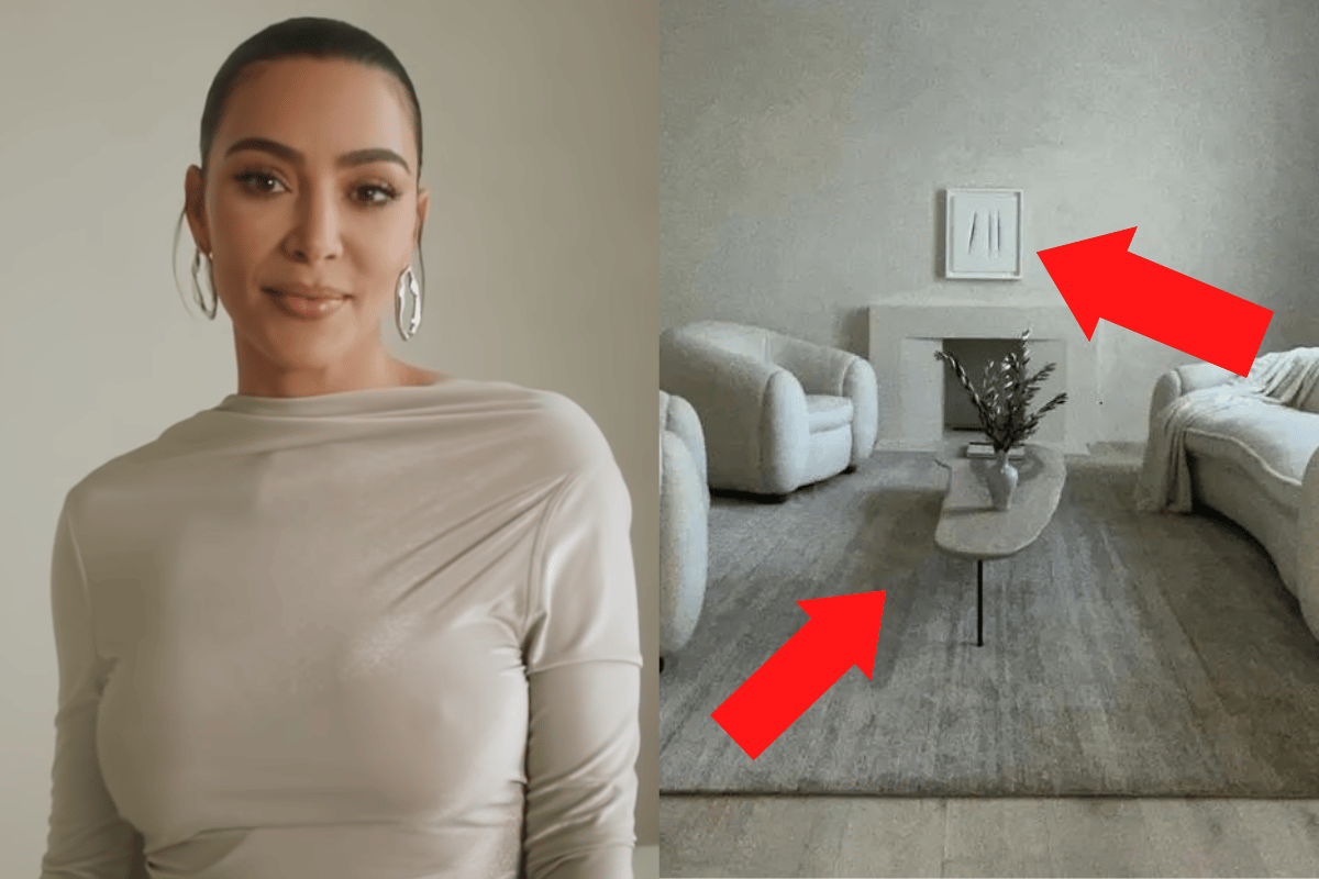
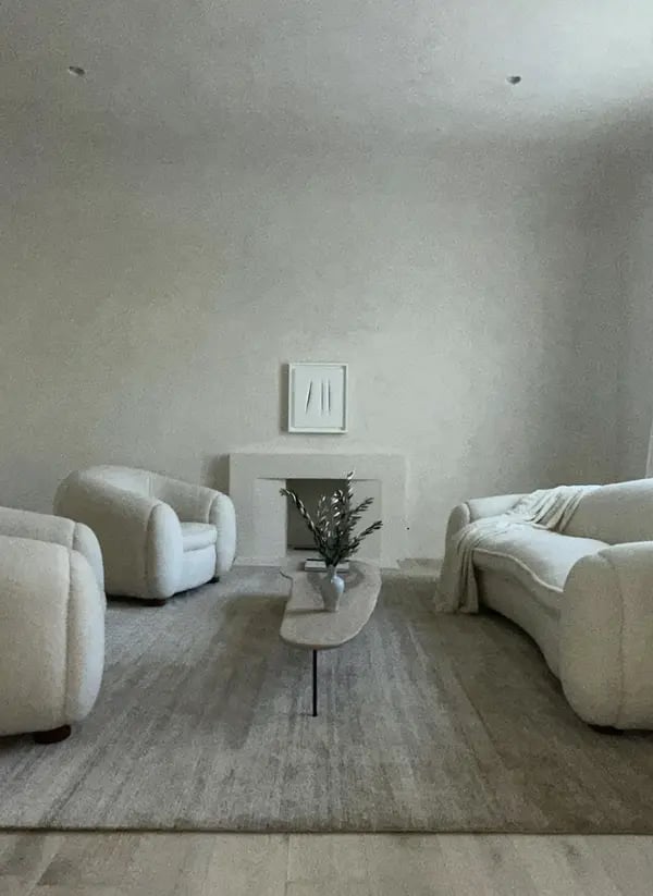
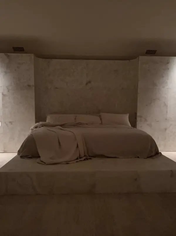
This week, Kim Kardashian posted a series of photos of her home. It made me recoil in response.
Not because everything is hundreds of thousands of dollars out of my price range, or because every photo looks like it was handpicked from Patrick Bateman's house.
But because... it was ridiculous.
Watch: Kim Kardashian and Kanye West quiz each other on home design. Post continues after video.
Let me show you.
So we start with an ordinary photo... of a mug. And what jumps out to me (and the rest of the internet) is how bad the photo is. Why is the cup... on an angle? Why is it the colour of grey water? Where is the ugly logo planted on the middle of it? Why the f**k do I care so much?
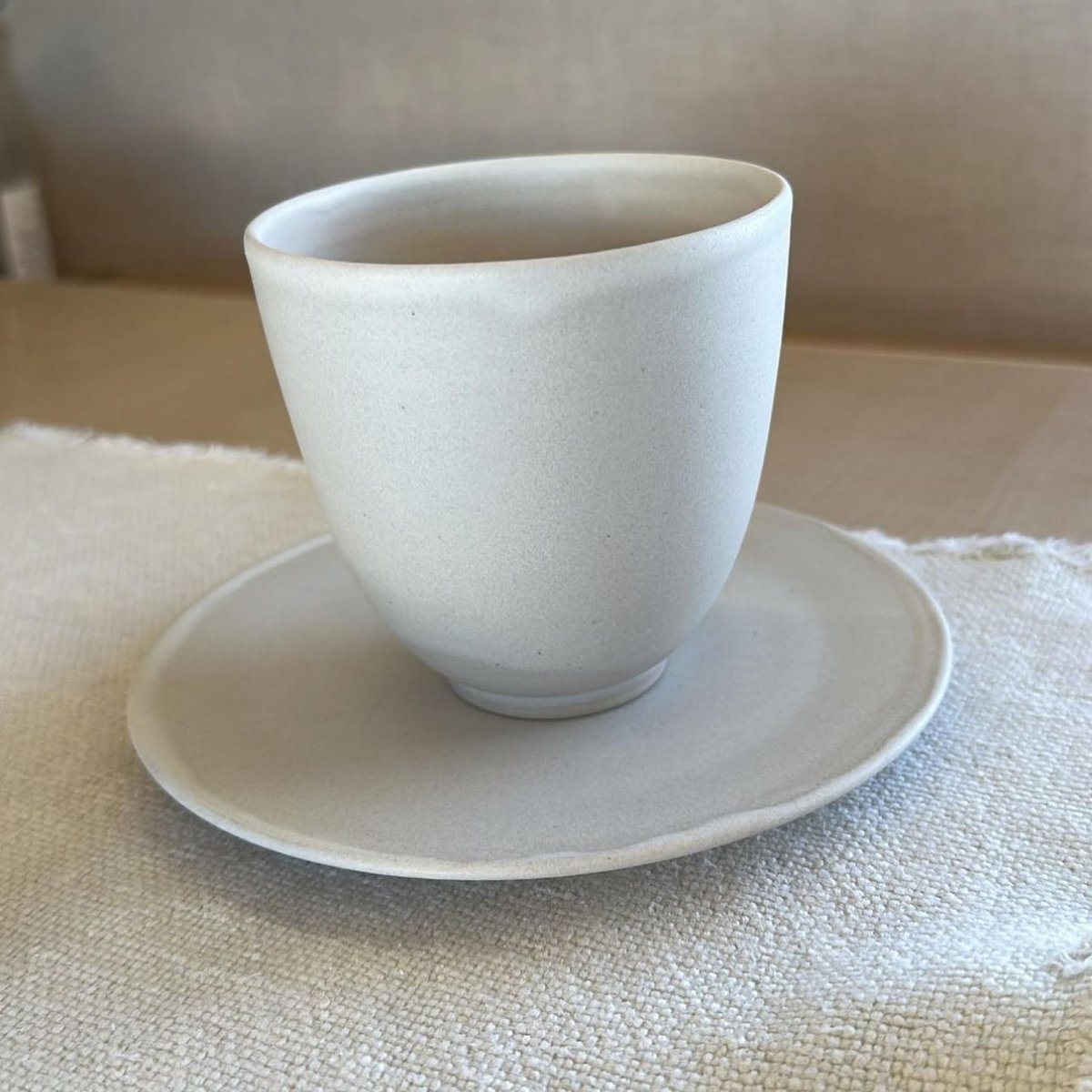 This water in this cup could be grey and I wouldn't even know. Image: Instagram @kimkardashian.




Top Comments