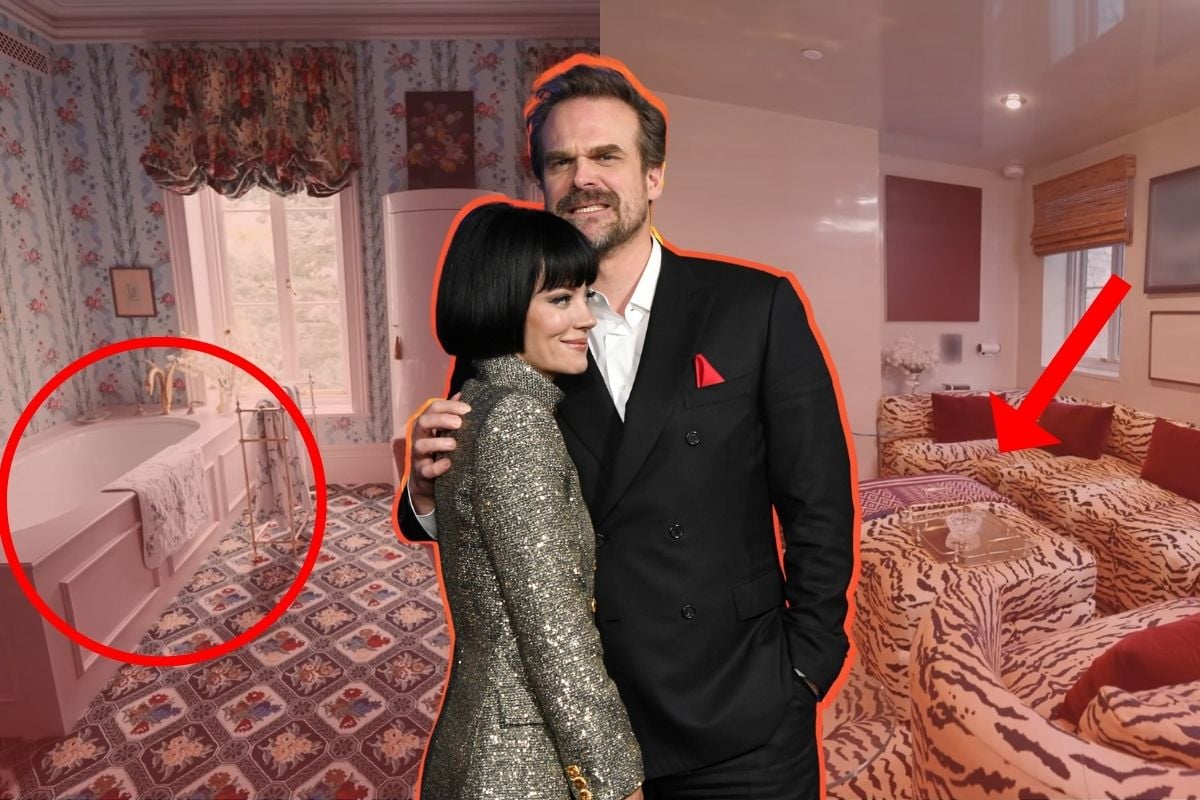
home

'David Harbour and Lily Allen just shared their home with us. And I really wish they hadn't.'

This story isn't about David Harbour. Or Lily Allen. 

It's about my green, jealous rage. It's about a 20-something woman who wants want they have, but likely never will. 

Specifically, their absurd, late-19th-century brownstone in Brooklyn, New York.

Because, if you'll indulge me for a second, there's nothing worse than a beautiful home that is millions and millions of dollars out of your price range.

Watch: The holiday mistakes that attract burglars. Post continues after video. 


Video via Mamamia.

When a celebrity has a home I don't particularly enjoy, I relish it. I criticise the bedrooms and 'open plan' spaces with glee. I tear apart all the ugly artwork with all of its beige and white. I make known the fact I detest kitchens that are decorated with one lemon and a single black kettle. I reason that it must be so painful to be so wealthy with such bad taste.

But Allen and Harbour's home, in all its stupidity, in all its grandeur, is my dream home. And now I feel bad for being poor, so thanks a lot, guys.
ADVERTISEMENT

Recently, the couple gave a tour of their rather large Italianate brownstone to Architectural Digest and I want to talk about why it has broken me out in hives. 

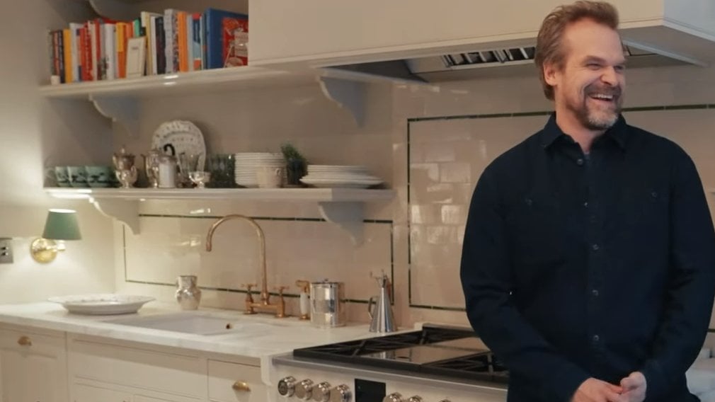
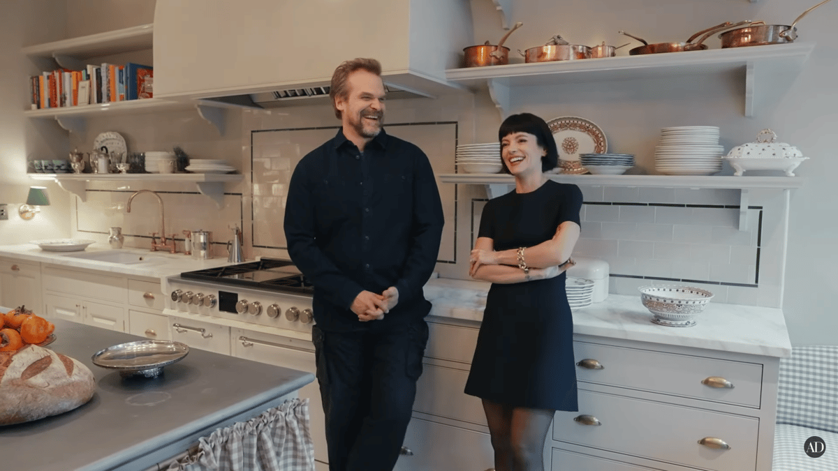
First, we begin in the kitchen. They haven't stolen it from me, per se, but someone has definitely had a look at my Pinterest board because it's everything I've ever dreamt of for myself. 

Why are you two giggling in MY kitchen? Image: AD.

ADVERTISEMENT

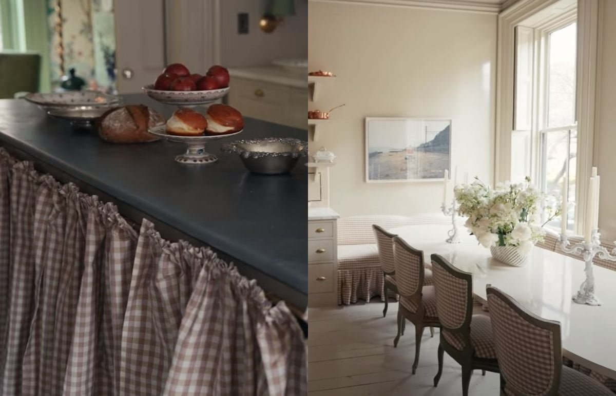
Designed by Billy Cotton, the couple's kitchen looks like something straight out of a 1950s cottage. But lavish. Oh, so lavish. 

There is a plum-coloured check fabric used on the chairs and the bench seat andoddly enough, the curtains on the cabinets. Yes, they've used curtains to replace DOORS! It's innovative, it's genius, it's arguably budget friendly, and it makes me angry. Because I want cute, plum-coloured curtains on my cupboard doors too.

It's revoltingly beautiful. Image: AD.

ADVERTISEMENT

There are many reasons they're better than normal cupboard doors, and I will explain why: 

  • It makes everything so much easier and safer for chubby little bubbas with their chubby little fingers. 
  • You can get away with sneaking snacks from the cupboard because curtains don't slam.
  • They're ugly in a way that is adorable and aesthetically pleasing to (my) eyes.

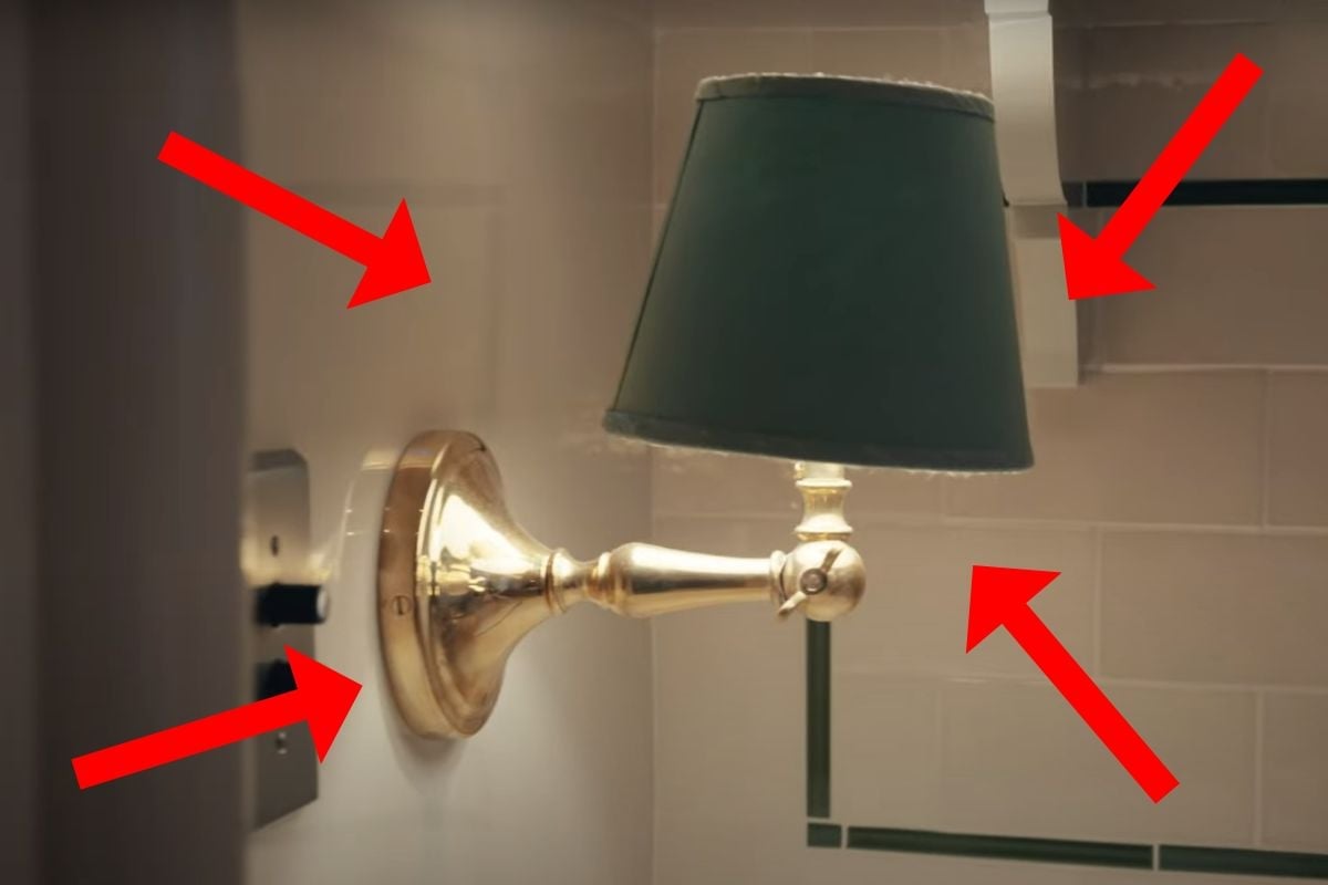
Before I move on, I mustn't forget to mention the tiny lamp in the corner. The lamp that will haunt me for the rest of my life until I, myself, am able to afford a lamp as useless as this one. 

Do you see it? Image: AD.

ADVERTISEMENT

How about now? Image: AD.

HOW ABOUT NOW? Image: AD.

ADVERTISEMENT

The tiny wall lamp, which is apparently called a sconce light, is tucked away into the corner. Arguably providing zero light to anything except that said corner.

In the couple's house tour, Harbour admitted he "freaked out" when he saw it because he too, like the rest of the world, found it to be utterly useless. 

However, I am glad Cotton told him to shut up. Because it's glorious. And it's cute that their kitchen has a night light.

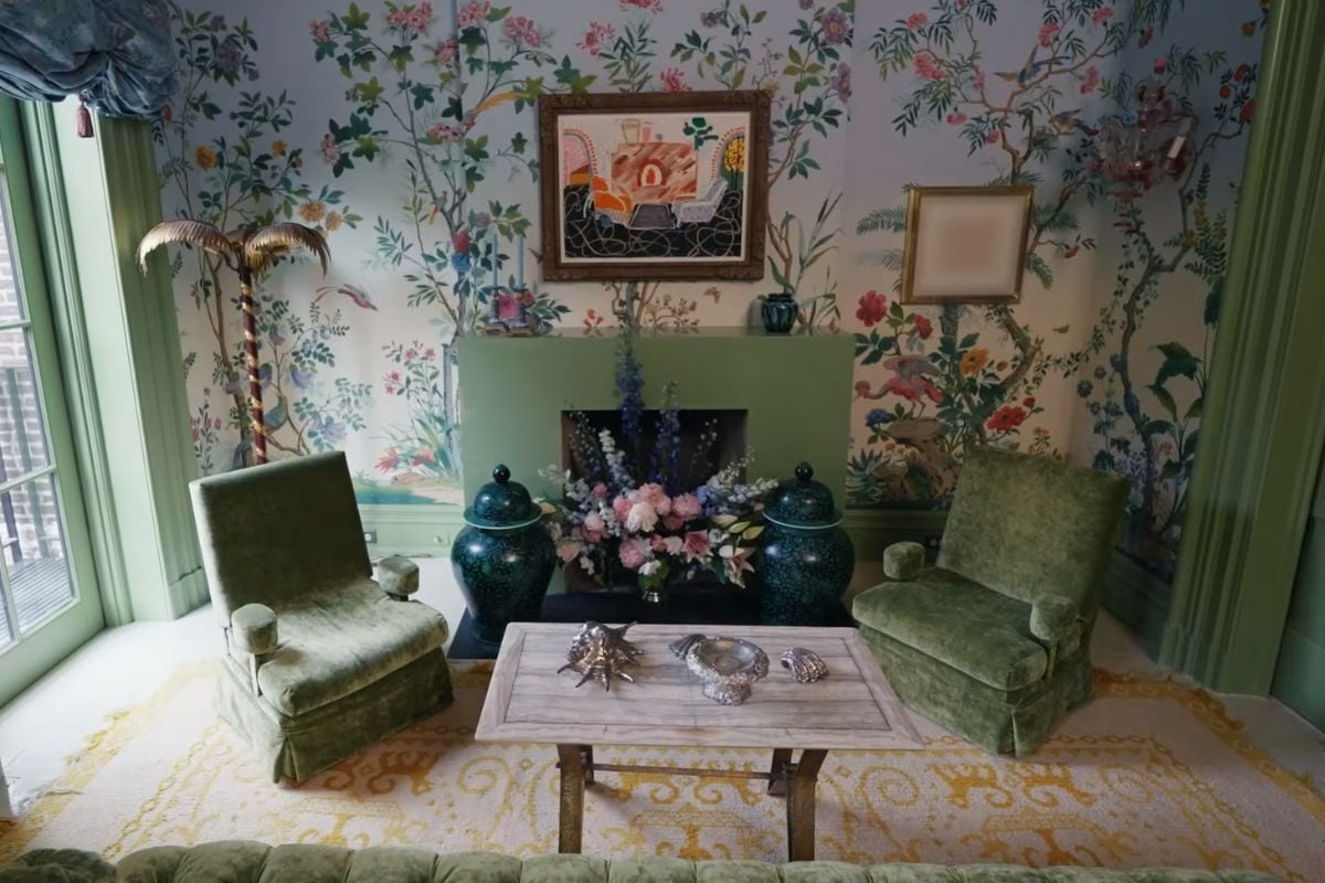
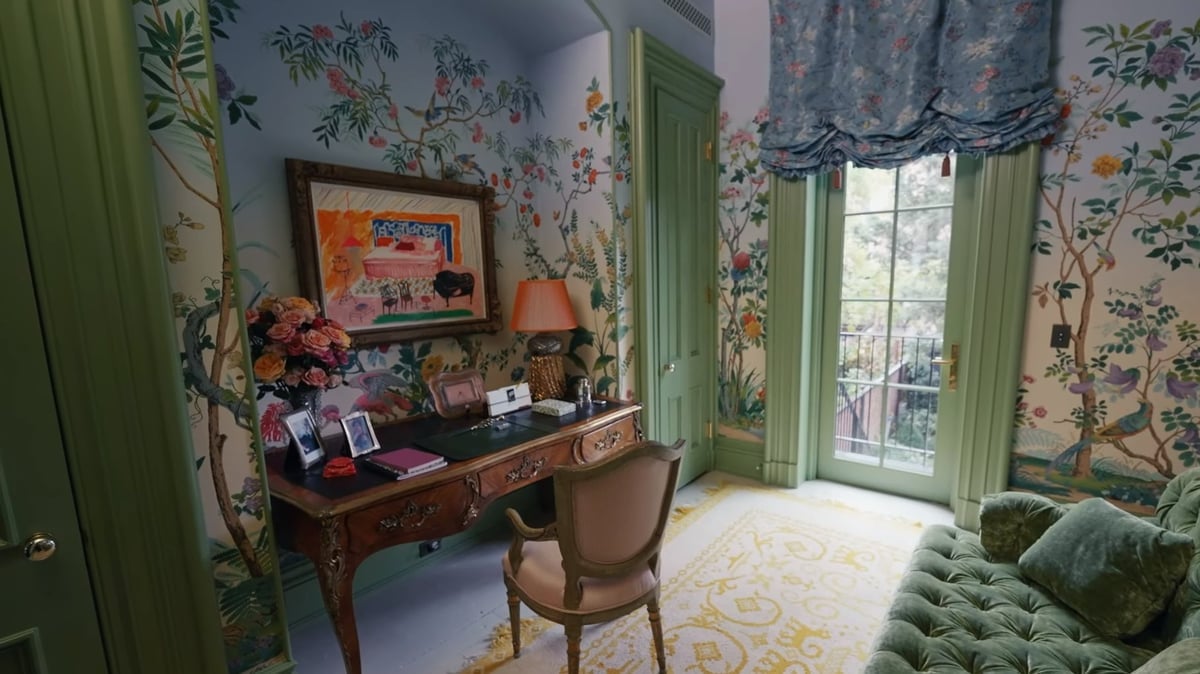
Next, we move on to the 'sitting room' (aka the good room) and yeah, it's just as weird as the kitchen. But somehow, it's also perfect. In every single way.

ADVERTISEMENT

It's ludicrous how many colours they've managed to shove in one space, but I'm not complaining because I want to sit there for the rest of my life.

See all that colour? Image: AD.

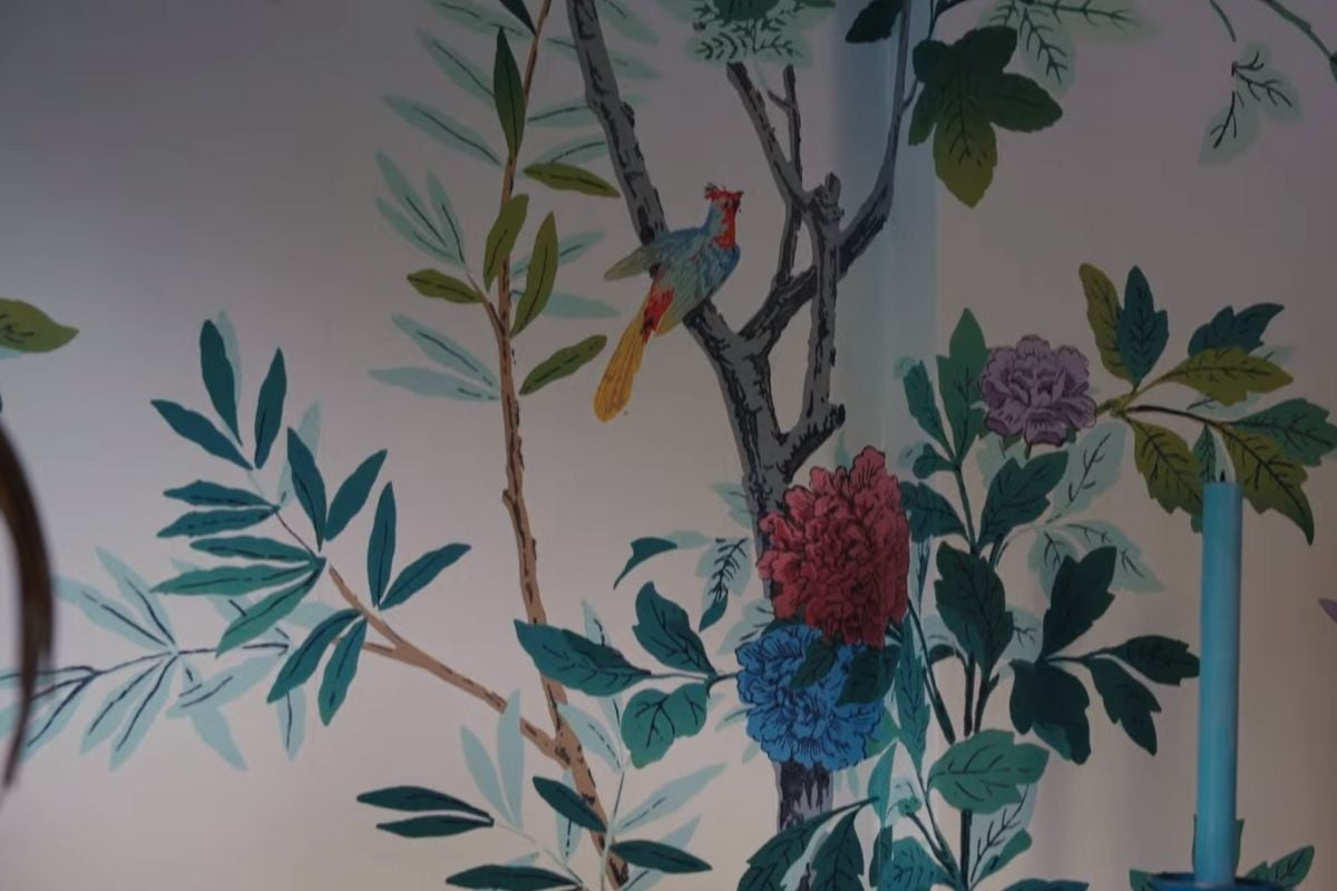
The best wallpaper of all time. It's hand painted, too. (PS: If you're wondering if you could afford to have it in your home, you probably can't.) Image: AD.

ADVERTISEMENT

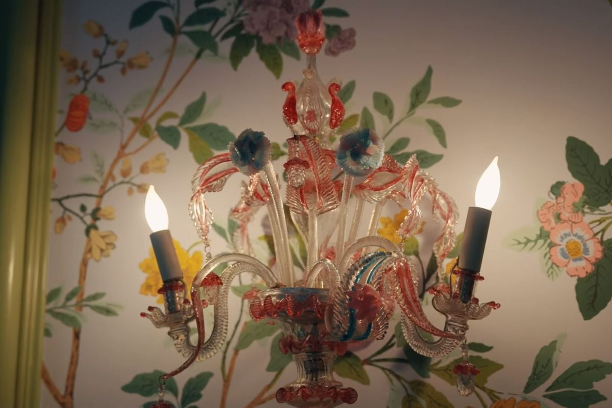
There's also this light that I'm sure I've seen in an op shop before. Image: AD.

ADVERTISEMENT

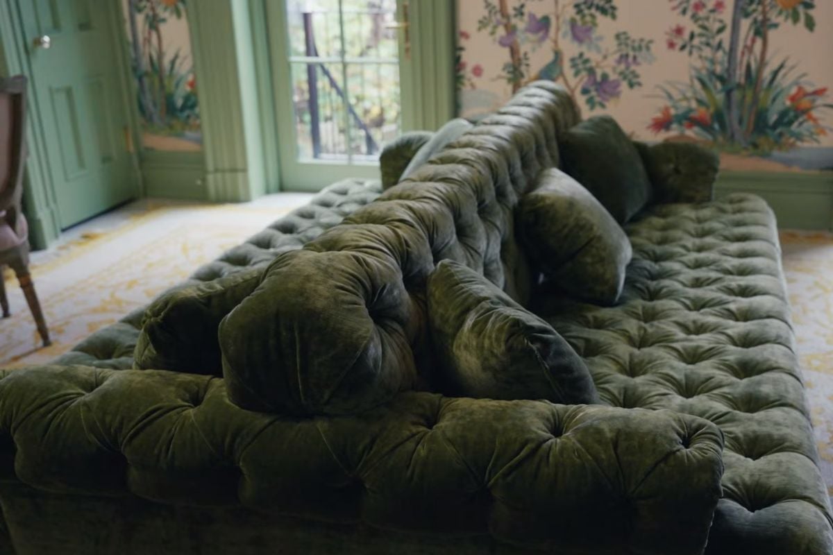
The star of the show is this double-sided sofa. Yep, you read that right. Image: AD.

ADVERTISEMENT

Plus, this very official-looking desk. Image: AD.

ADVERTISEMENT

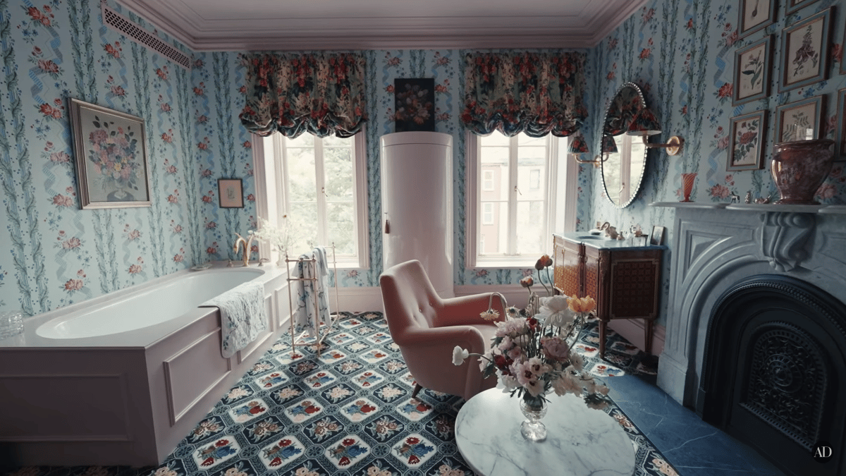
Next up is the bathroom. I mean, I think it's a bathroom?

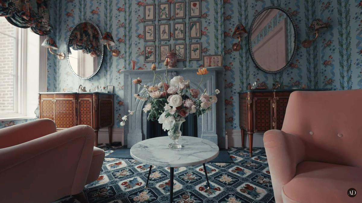
There's a bathtub. And carpeted floors. And a fireplace. And a vanity. And a reading chair. AND A FRIDGE?!

I am... confused. 

Just let me sit with my confusion for a sec. Image: AD.

ADVERTISEMENT

Like, it's so beautiful. But it's also so f*cking weird??? 

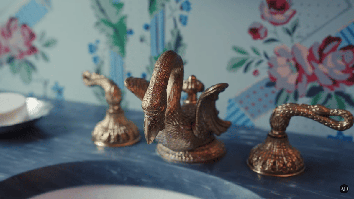
Harbour admits he took over designing this room, adding he wanted swan taps and a fridge from outer space. I'm so glad you got everything you wanted, sweetie, but I'm not going to pretend like it's not the most bizarre thing I've seen since Kim Kardashian's cemetery house.

It's a lot. Image: AD.

ADVERTISEMENT

David Harbour's dream taps. Image: AD.

I think we should move on because I am settling into an uncomfortable feeling that I don't enjoy. (That feeling is a fiery envy, btw.)

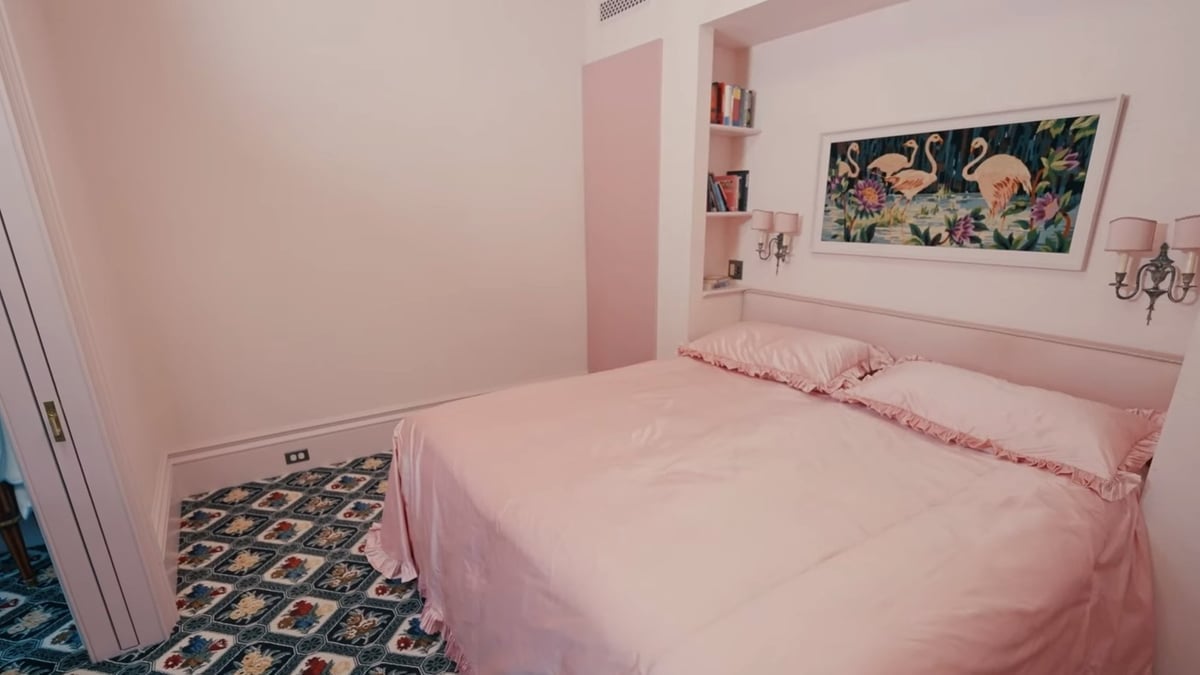
Harbour and Allen take us to their bedroom which is something I would have never expected. It's all pink. It's windowless. It's arguably very small for very rich people. And it's weird. 

ADVERTISEMENT

Do I like it? Yes (because I am just as weird as them).

Will everyone else? Absolutely not (because other people are normal).

Where's the rest of it?! Image: AD.

We're not done yet though because there is more madness. 

ADVERTISEMENT

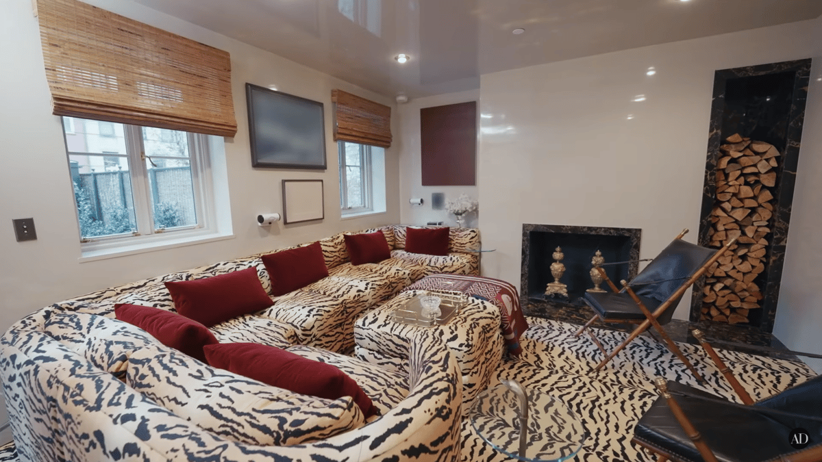
And it's a tiger print filled TV room.

Oh... Image: AD.

Okay, I'm not sure about this room... Image: AD.

ADVERTISEMENT

Once again, they don't actually use their fireplace because apparently rich people don't do that anymore. 

At this point in the tour, I realise that there are so many things I never knew existed. But now, oddly enough, I want it all. But I likely will never have it. 

So, thanks AD. Thanks a lot.

You can watch David Harbour and Lily Allen's full house tour here: 

Feature Image: Architectural Digest.

Love watching TV and movies? Take our survey now to go in the running to win a $100 gift voucher.