beauty

Pantone announce not one but two colours of the year for 2016.

Image: iStock.

It’s the colour you can expect to see take over fashion racks, beauty counters, interior design mags and the paint aisle in your local Bunnings, but there’s a big difference with this year’s Pantone Colour of the Year announcement.

Yep, the institute have announced that there’s not one but two colours of the year for 2016.

After years of bold and vibrant colours like Marsala and Emerald Green, the colours are a little, well, traditional.
Image: Pantone


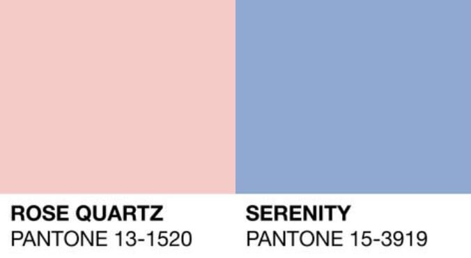
Say hello to soft pastel pink Rose Quartz (AKA color swatch 13-1520,) and calming baby blue Serenity (color swatch 15-3919) - a pairing of colours anyone who's stepped foot into a nursery will know too well.

ADVERTISEMENT

While many try to pick the colours ahead of the formal announcement, Wall Street Journal had it spot on, after also getting the scoop a day earlier than other media outlets last year with the wine-hued Marsala.

Of course the big question on our lips is: why two colours?

According to Vice President Laurie Pressman, it's all to do with what the colours represent together.

"This is a fusion of two shades. Rose Quartz is a warm and embracing gentle rose tone that conveys compassion and a sense of composure. Serenity reflects a mindset of inner peace," she told ABC News.(Watch: The easy guide to colour correcting. post continues after video.)

While the colours may seem very gender-binding and traditional, by choosing the two colours Pantene could actually be making the opposite statement - a movement reflected on the catwalk in shows like Chanel and Cavalli.

"People want choices. They don't want to be pushed into a specific direction. They want to make that choice on their own. Today's genderless styling is definitely a more modern approach than we've seen in the past, and it's not necessarily trying to make a man look like a woman or a woman look like a man. It's about creating a canvas," said Pressman.

ADVERTISEMENT

Hm, see what we mean?

Although you can expect to see vivid brights popping up representing excitement and optimisim, the soothing qualities of the chosen two were carefully considered to reflect the current political and economic climate. (Post continues after gallery.)

"Our lives are stressful, and what we're seeing is consumers trying to cut out that noise by balancing the fast pace, their fractured lives, their hurried lives, with some downtime and some calm, and the opportunity to just switch off," said Pressman.

For the eagle-eyed, the announcement comes as no surprise with several clues hidden in Fashion Colour Report for Spring 2016 released in September. It named the top 10 influential colours for the season and surprise, surprise Rose Quartz is listed first, with Serenity at number three.

The institute calls on experts from multiple creative industries across different nations to come together and decide the colour and fashion, film, technology, art and travel destinations are all studied. The chosen colour usually significantly influences collections and trends for that year and beyond.

And in a first for the institute who has picked an annual colour since 1999, this year's double choice has the potential to influence our attitude as well as our aesthetics.

Do you like the idea of having two colours?