Coles announced today that it has pulled fashion magazine Harpers Bazaar from it’s shelves due to this “inappropriate” cover image:
“We didn’t think the cover was appropriate for our stores so the decision was made [to remove it],” a Coles spokesman told Fairfax media.
The magazine’s editor, Kellie Hush, is not impressed. “I have had so much positive feedback from around the globe, it is a shame Coles does not also recognise the artistic integrity of this image,” she told Fairfax. “As Gloria Steinem says: ‘The human body is not obscene.’ ”
No, it’s not. But it appears there are some who don’t want to look at it while they’re buying their Rice Bubbles.
Kellie and I have long clashed, loudly and publicly over the way magazines portray women, particularly over the rampant use of photoshop and the lack of diversity among models. But I respect her as an editor and I feel her pain today.
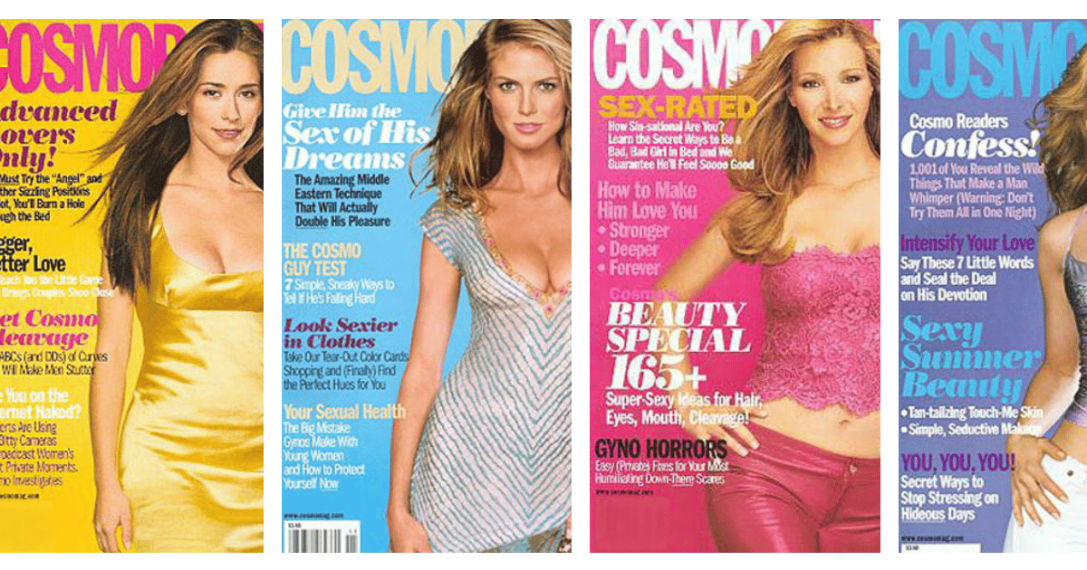
Once upon a time I edited a magazine that was pulled off the shelves at Coles and Woolworths for similar reasons.
The contentious issue was withdrawn because it had a particularly raunchy coverline, “Oral Sex Lessons”, in giant type in the left hand corner. It was Cosmo. It’s what Cosmo has been doing since the 70s using virtually identical words and phrases.
Still, there was something in the public mood that had shifted and I hadn’t noticed.
Top Comments
I have wondered if mothers such as Miranda Kerr, who pose nude realize that the message which they are sending their children, is, if someone has a camera it's okay to drop your pants, or if someone pays you enough it's fine for them and any stranger etc. to see your bits. I have seen a photo of Miranda and also Gigi looking over their shoulders with their backsides spread so far open that comments debated if their bit which a g string usually hits, is actually visible!
hmmm.... i don't usually comment on these kind of things, and i stumbled across this article because i was scrolling through Facebook, bored on a sick day from work. I'm a 30 year old woman. I don't usually buy fashion magazines, or pay much attention to fashion at all, and I work in a male dominated industry where I'm able to remain blissfully oblivious. I don't have many female friends. Just those close to me from school and a few like minded people I've met along the way. The reason being, I find it so boring and exhausting focusing on looks, diet (or lets cover it up and call it 'health' to pretend we are not focusing on our looks), exercise, gossip etc etc. I cannot follow anyone who posts duck faced selfies or full body shots in their latest spray tanned wedding ensemble. I just can't stand it. So, I grew up as a girl who chose to not have this body image pressure put on me, NOT BY MEN, but by other women around me...... by the women who are fuelling this sickening industry. By the idiots who glorify gigi hadid and kendall freaking jenner- the most useless piece of bacteria to roam this earth. Therefore i do not want this image shoved in my face when i walk around coles to buy my milk and eggs. GIRLS, you have done this to each other. My brothers, male friends, and workmates never placed this pressure on me, It was all from friends and the fashion industry, and from unavoidable magazine covers such as this. Its sick, its pathetic. Get a real job, get a life, get over yourselves, and take this crap off the shelf. I don't want my daughter growing up around this.
Sure, you say that now but you'll change your mind when you know who the latest Taylor Swift girl squad is.
Haha ... Well At least Taylor swift has a talent! I can appreciate that ! She is not riding the success of her half sister's sex tape.
I can appreciate a beautiful woman, I won't lie! but not one without a noteworthy talent of her own.