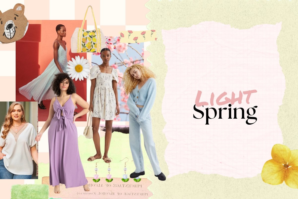
Picture a soft sunlit morning with pastel florals. This is light spring.
This colour palette sits in between true spring and light summer on the seasonal flow chart and is characterised by a harmonious blend of soft, warm, delicate and luminous hues that reflect the gentle natural beauty of people who fall into this season.
How to tell if you're light spring.
Light spring is categorised as the following: medium-warm hue, light value and medium chroma.
Medium-warm hue: Colours lean towards the warmer end of the scale without being too extreme. This means all colours contain more yellow than blue (the coolest colour of all) undertones, so even if blue does appear, it will still have warm hints of yellow, like turquoise or teal.
Light value: In line with the season's primary colour aspect, all colours are low in value — meaning they are very light. If darker or medium-value hues appear, they only act as supporting colours for the light ones.
Medium chroma: The majority of the colours are pastel, meaning they are a blend of bright and light.
Watch: Comfy Lux Hacks For Really Long Days. Post continues below.
What is light spring's colour palette?
Light spring's best colours include:
Soft pastels: Light peach, fresh mint green, gentle lilac and pale coral
Warm neutrals: Soft ivory, light taupe and beige
Deeper hues: Hints of muted mauve and warm olive
On the flip side, the colours to avoid if you're light spring include: